In all relationships, first impressions matter. For a winery tasting room, the goal is to set the stage for the experience to follow. The best-designed tasting rooms express the winery’s spirit, engage the senses and entice your imagination. Here’s a selection of tasting rooms that forge powerful connections between design and wine.
Historic Spaces Reconsidered
Tank Garage Winery
1020 Foothill Blvd., Calistoga, CA 94515
Architect: Steve vonRaesfeld, vonRaesfeld & Associates Architects, vra-arch.com
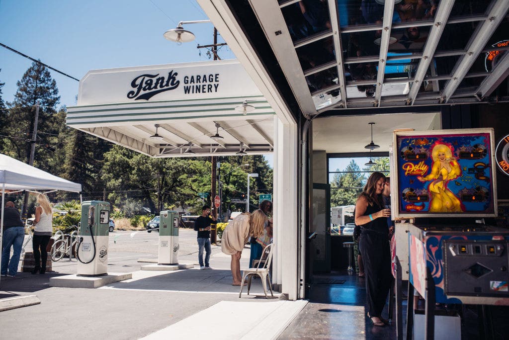
A broken-down 1930s gas station was an unlikely inspiration for the winemaking duo of James Harder and Jim Regusci.
“If you live in Napa Valley, you’ve probably driven by this old garage thousands of times,” says Harder. “It was a matter of being so inspired by this old Art Deco building’s character and history that we had to channel that passion into wine.”
Fear of winery decorum norms didn’t slow them down.
“From the onset, we knew putting a winery inside an old garage in traditionally proper Napa Valley would be unconventional, maybe even shocking,” says Harder. “So once we took those handcuffs off, everything was fair game.”
Petaluma-based architect Steve vonRaesfeld oversaw the renovation, and implemented a theme he calls “steampunk, 1940s industrial.”
“At its core, Tank is a celebration of vintage California,” says Harder. The gas station was once owned by Eddie Bratton, a renowned Indian motorcycle mechanic and daredevil racer, and the tasting room’s design embodies a youthful, rebellious spirit.
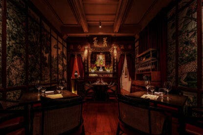
A 40-foot glass door rolls up to reveal the Lubrication Bar, where Bratton’s red 1947 Indian Chief is on display. There’s also a secret back room for members, with velvet walls and twinkling chandeliers reminiscent of a Prohibition-era speakeasy.
“Younger consumers don’t want to go to mom and dad’s tasting room,” says vonRaesfeld.
“We designed our tasting room in a way that allows our people to sit closely with our guests,” says Harder. “We are trying to give people a wine experience unlike anything they’ve ever had.”
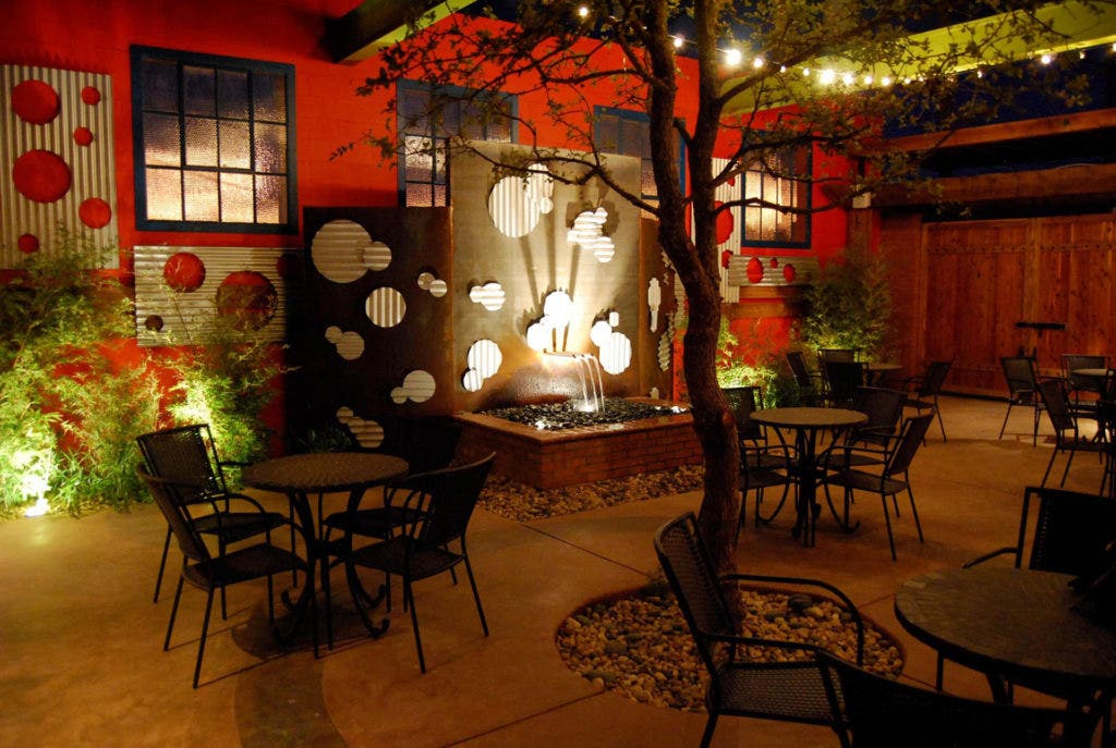
McPherson Cellars
1615 Texas Ave., Lubbock, TX 79401
Architect: Condray Design Group, condray.com
A former 1930s Coca-Cola bottling plant serves as headquarters of McPherson Cellars. It was a family project for winemaker Kim McPherson and his wife, Sylvia, an experienced interior designer and landscape architect.
“We are part of the redevelopment program for the historic depot district of our downtown, and some of the first to open up new businesses in the area,” Kim explains.
The long brick building was a familiar local landmark. Its distinctive streamlined features appealed to the McPhersons, like the extensive plumbing and wastewater infrastructure left from its Coca-Cola past.
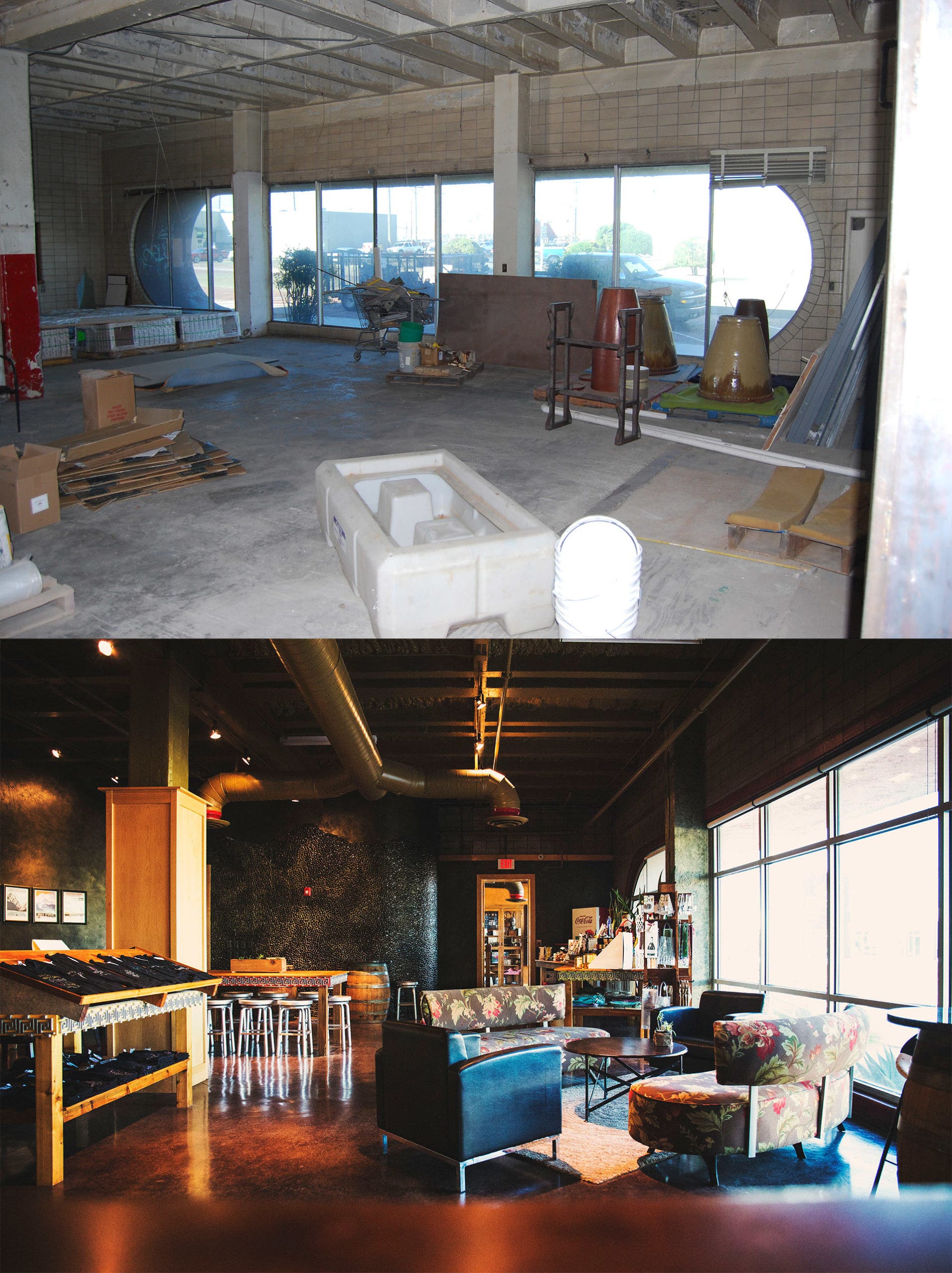
“The desire to keep the ‘modern’ style was a priority for us,” Sylvia says. “The tasting room’s curved wall was designed to complement the lines of the renowned pill-shaped window. It creates visual interest while optimizing the space with the resulting concave shape.”
Curvy tables, benches and sofas repeat the theme.
The structure’s original materials like its brick, cinderblock and windows were preserved and refurbished, and complementary new elements like polished and sealed concrete were added. Pops of color keep with the building’s history, and the design’s overall effect is retro-modern industrial.
“We were never trying to emulate ‘Tuscany in Texas’ or the elegance of Napa Valley tasting rooms,” Kim says. “We want to provide the best hospitality to our guests and insight into our winemaking and the region in which we’re making wines, to champion our own backyard, from the terroir of the Texas High Plains to the history of downtown Lubbock’s Depot District.”
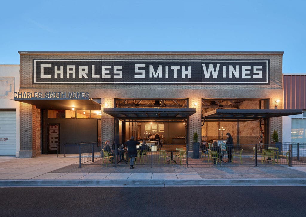
Charles Smith Wines
35 S. Spokane St., Walla Walla, WA 99362
Architects: Tom Kundig, Olson Kundig, olsonkundig.com
It’s not surprising that Charles Smith, a self-taught winemaker who once managed rock bands, would take a bold approach to wine tasting.
“Charles’s philosophy is, ‘It’s just booze—drink it!’ and he wanted to capture that rock ’n’ roll feeling in the space,” says architect Tom Kundig, owner and design principal at Seattle’s Olson Kundig.
“[Smith] expressed his desire to maintain the grittiness of the garage space—that this should be the finger in the eye of the wine world,” says Kundig. “He didn’t want to dress it up too much or ‘polish the soul out.’ ”
Smith set his sights on Walla Walla’s former Johnson Auto Electric building, built in 1917.
“The idea was to take an old structure and repurpose it so it could live in the modern world, but still point to the history and the life that it lived,” says Smith. “I reached back into my history and used that in the culture of the space to communicate where I came from and where I’m going.”
The revived structure is designed to be both rough and ready.
“[Smith] expressed his desire to maintain the grittiness of the garage space—that this should be the finger in the eye of the wine world,” says Kundig. “He didn’t want to dress it up too much or ‘polish the soul out.’ ”
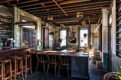
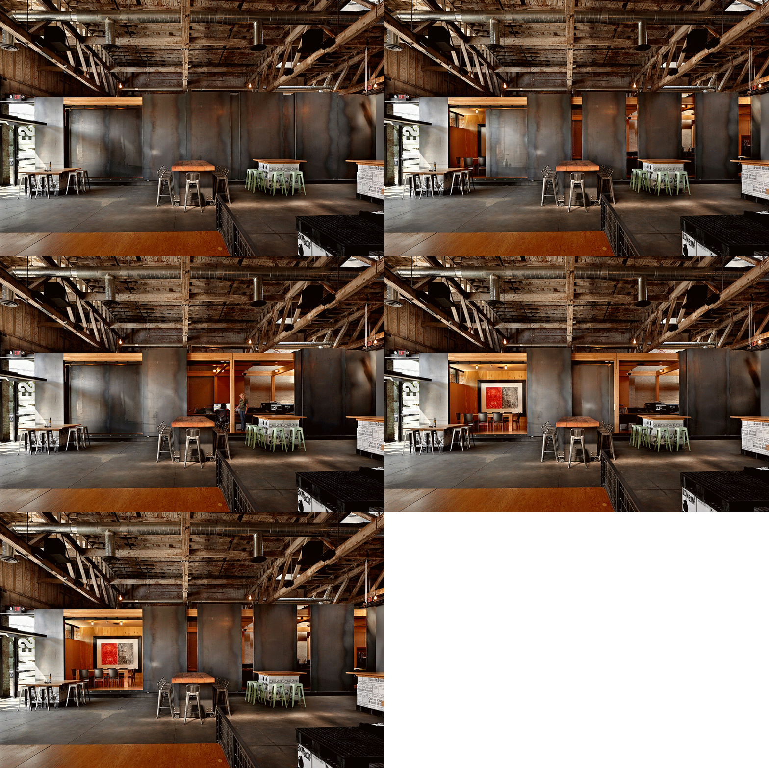
So they left the interior raw and open, retained the original brick walls that came complete with old scribbles, as well as its concrete floors and wood trusses. They added tables made of timber and steel, and also a bar.
“The concept of the ‘drive-through’ was important, both as a nod to the original automotive history of the building and as a means of creating a highly adaptable space,” says Kundig. “We replaced the garage doors with two custom, hand-cranked pivot doors. They completely open the space up to the street and form an awning for outdoor seating.”
Along with a prefabricated 70-by-20-foot office shell nicknamed “the Armadillo,” there are floating “rafts” to support seating or a stage, interlocking tasting tables and a sliding panel that doubles as a video screen.
“It is a living, breathing thing that is in harmony with my wine,” says Smith.
New Spaces
Osoyoos Barn and Visitors Center at Mission Hill Family Estate Winery
1730 Mission Hill Road, West Kelowna, Okanagan Valley, BC, Canada
Architects: Tom Kundig, Olson Kundig, olsonkundig.com
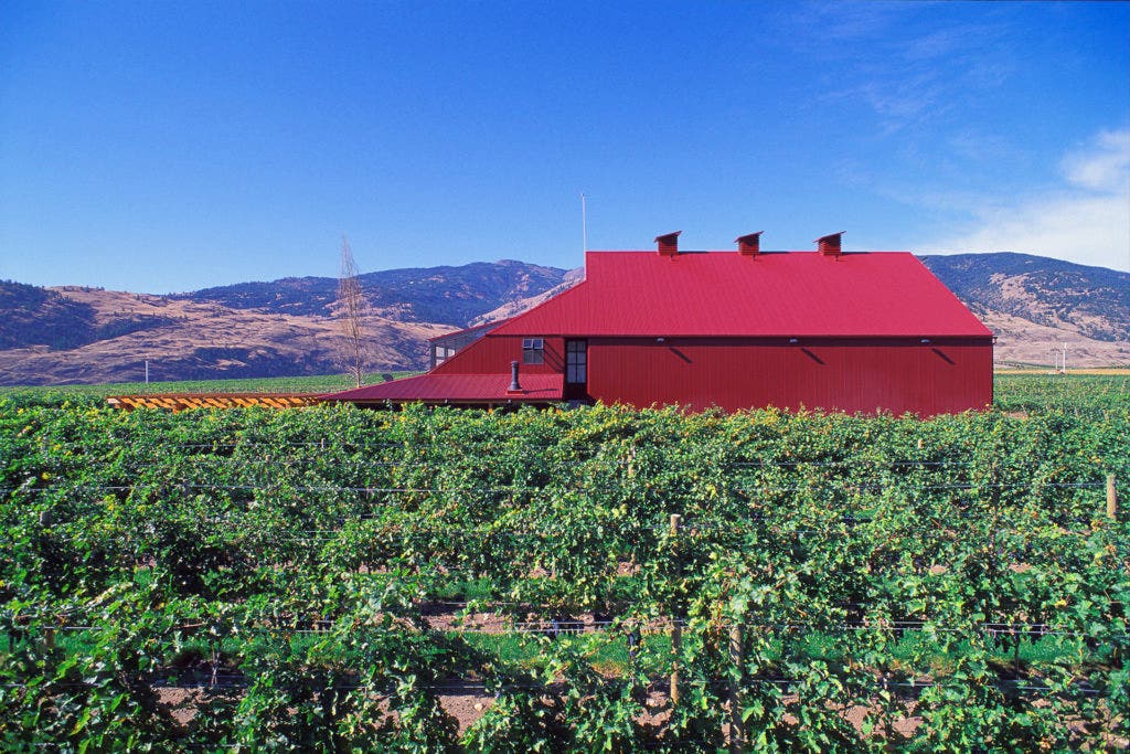
From the road, it may look like a stylish but otherwise ordinary big red barn in the middle of a green field. But the Red Barn at Mission Hill Family Estate houses a sophisticated viticultural tech center with a glass-walled tasting room hidden in the back.
“We wanted it to stand out without people thinking it looked out of place,” says Darryl Brooker, general manager of Mission Hill.
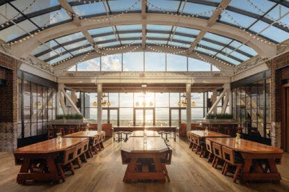
The tasting room is simple, rustic and bathed in natural light.
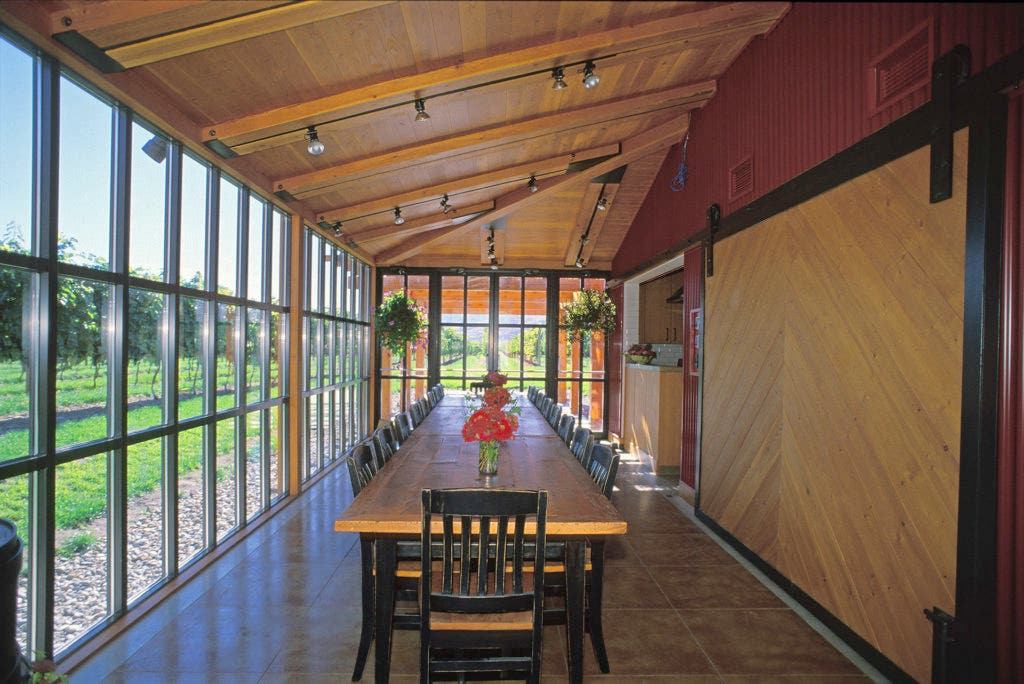
“It is really just a glass box in a vineyard,” says the architect, Tom Kundig. “We wanted the space to be restrained and without any noisy elements, so there would be no distractions from the wine.
“We used a relatively dark palette, with the idea that the interiors would fade away into the shadows. [The region] has a very sunny climate, so we wanted to keep the focus on the brightness of the vineyard and the mountains, and landscape beyond.”
An indoor table seats 30, while outdoor seating under a vine canopy and a full commercial kitchen allow year-round flexibility.
One of multiple separate tasting spaces at Mission Hill, the Red Barn has an educational focus. It brings visitors right into the vineyard for lunch or a tasting among the grapes.
“We thought it would be great for visitors to come and see the viticulture team in action,” says Brooker. “We can try wine with people and then walk them out and show them the vine that it came from. It’s about teaching them about how the grapes are grown.”
L’Angolo Estate
18830 NE Williamson Road, Newberg, OR 97132
Architect: Thomas Robinson, LEVER Architecture, leverarchitecture.com
“How do you create something that’s current, but that’s very much about the place and the history?”
That’s the question that Thomas Robinson, founder and principal of Portland’s Lever Architecture, faced when he began to design a tasting room for Oregon’s L’Angolo Estate. The solution? Start with the land itself.
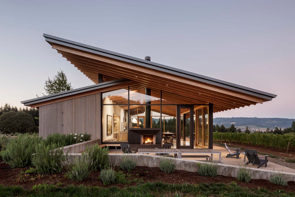
“The building is expressive of the landscape in the same way that good wine is connected to the landscape,” says Robinson,
“The view was critical,” says Jacob H. Gray, hospitality/DTC manager for L’Angolo Estate. “Situating the tasting room right in the vineyard brings the vines, hawks, sky and trees inside.”
With a distinctive roofline inspired by the spreading canopies of Willamette Valley’s native oaks, the building takes the form of a welcoming natural shelter.
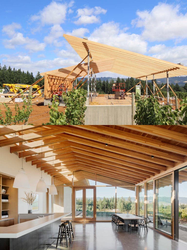
“We wanted to join our love for the clean lines of modern architecture with the utilitarian shapes of the agricultural buildings dotting our landscape,” says Gray.
“Our interest was taking a relatively common structural element and putting it together in such a way that is very surprising,” says Robinson. “We’re looking at a way of building that’s connected to the culture of Oregon, and timber is a big part of that.”
The two wing-like roof planes artfully intersect and appear to float above the light-filled tasting room. Giant sliding glass doors offer open circulation to the vineyard and an outdoor seating area equipped with a fireplace.
The interior’s concrete counters and floors, and a blackened steel bar keep the focus on the wine.
“Meticulous craft and attention to detail are hallmarks of our winemaking approach as well,” says Gray.
TarraWarra Estate
311 Healesville-Yarra Glen Road, Yarra Glen, VIC 3775, Australia
Architect: Kerstin Thompson, Kerstin Thompson Architects (KTA), kerstinthompson.com
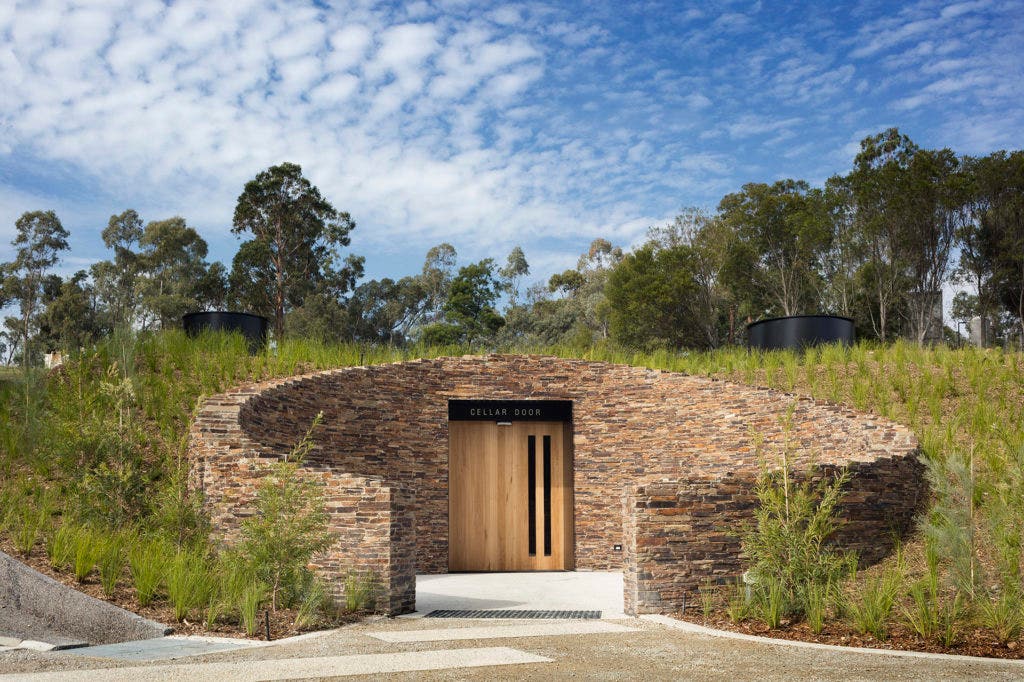
To step from the bright sunshine into TarraWarra’s Cellar Door is a little like passing through the rabbit hole from Alice in Wonderland.
“Visitors have no idea what to expect when they enter, and are all surprised by the space,” says Clare Halloran, winemaker and general manager. “It was appealing to me to do something unexpected. A glass box with amazing views would have been obvious, but we wanted something different, more subtle.”
Melbourne-based architect Kerstin Thompson created an inward-focused underground space with dramatic lighting and spare décor. A 30-foot-plus concrete tunnel adjoins the space and influences both the tasting room’s shape and style.
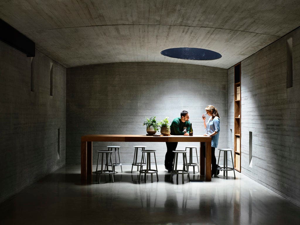
The designers added a wood texture to the concrete to soften its impact. They also used recycled timber from St. Andrew’s pier for the bar and tables.
“We wanted to add some warmth so that it was less industrial and more inviting,” says Halloran.
The large space can be divided to accommodate groups and provide privacy for special tastings, dining or meetings. Bold lighting that includes striking natural light chimneys help break up the space.
“This helps when you have a number of groups in there, so they feel a sense of intimacy, even though it’s one long tunnel,” says Halloran.
“When visitors come to the Valley, they’re here to spend some time, relax and enjoy themselves,” she says. “They don’t want to feel rushed or crowded. The Cellar Door is a space where anyone can feel comfortable trying our wines.”
Quintessa
1601 Silverado Trail, Saint Helena, CA 94574
Architects: Mike McCabe and Greg Warner, Walker Warner Architects, walkerwarner.com
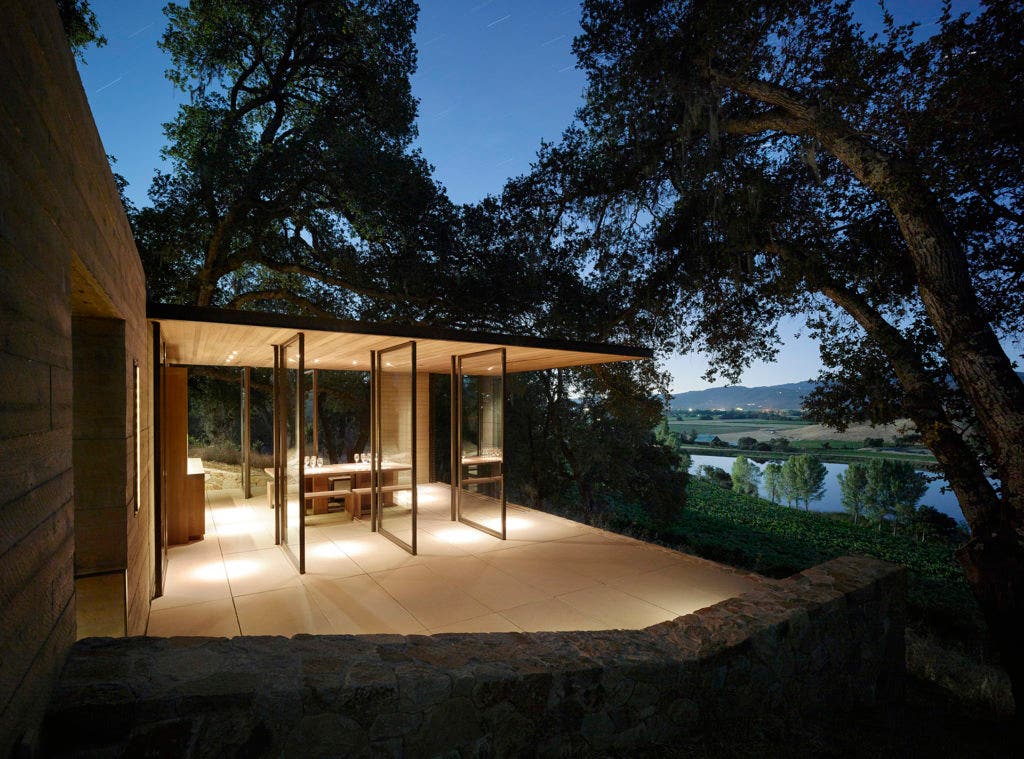
“My father had the idea of these very simple structures that we could put out in the middle of the vineyard,” says Agustin Francisco Huneeus. “We’re one of the few wineries that makes one wine from one piece of property, and my dad’s epiphany was, that’s where they should taste it.”
Mike McCabe, principal of San Francisco’s Walker Warner Architects, was tasked to design three small tasting pavilions that provide vantage points across the vineyard from the shelter of dense oak woodland.
“It’s strange for architects to talk about architecture as either a backdrop or a frame,” says McCabe. “These are beautiful to look at, but they’re really about putting people in a spot to look out and away from the buildings.”
“We wanted to do something that was very simple, very monastic, so that the building didn’t attract attention but the vineyard did,” says Huneeus. “It’s totally quiet, and the only thing you’re doing is focusing on the wine.”
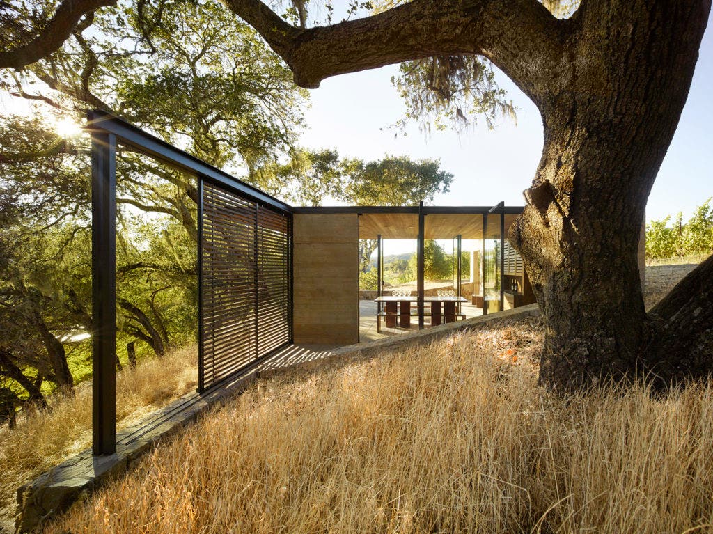
Each 250-square-foot pavilion is built from materials that harmonize with the natural setting of board-formed concrete walls, reclaimed cypress ceilings and casework, with local Napa Syar stone retaining walls.
McCabe says that he used “some structural magic” to produce very thin roofs with broad overhangs. In combination with elements that can open, slide and pivot, the pavilions have the flexibility to function both as shade structures as well as fully enclosed buildings.
Interior designer Maca Huneeus, who is married to Agustin Francisco, used spare, minimalist furnishings to keep with the simplicity of the structure. The sturdy, sculptural tables and benches are made from sustainable Afromosia wood.
“For me, it’s always about nature, and less is more,” she says. “We want to keep it about the vineyard, and about feeling the energy of Quintessa in the wine that you’re tasting. I want people to leave there and tell the story.”
Last Updated: October 31, 2022


